Color Coordination – Your Room and New Artwork
The artwork in your home says a lot about you. It reflects your personality and can add the final touch to a beautiful space in your home or office. So, how do you choose? There are lots of colors, sizes, expression and mood pieces to choose from. Think about what you want your new piece to say. is it peace, fun, nostalgia or even sadness?
New Artwork Must Be Chosen Carefully
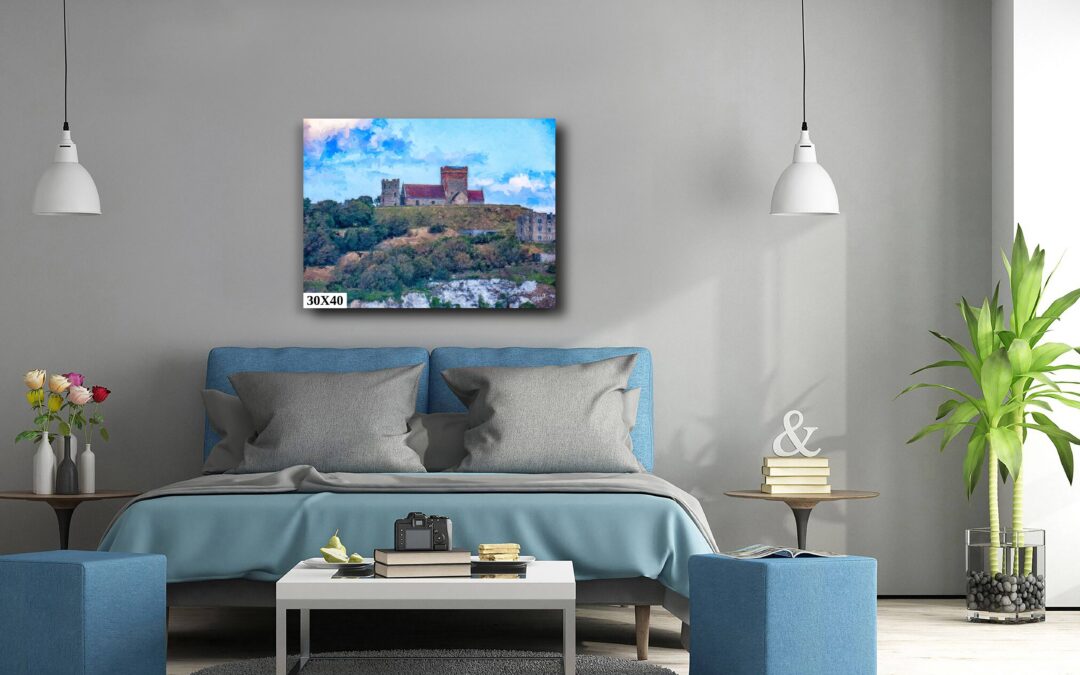
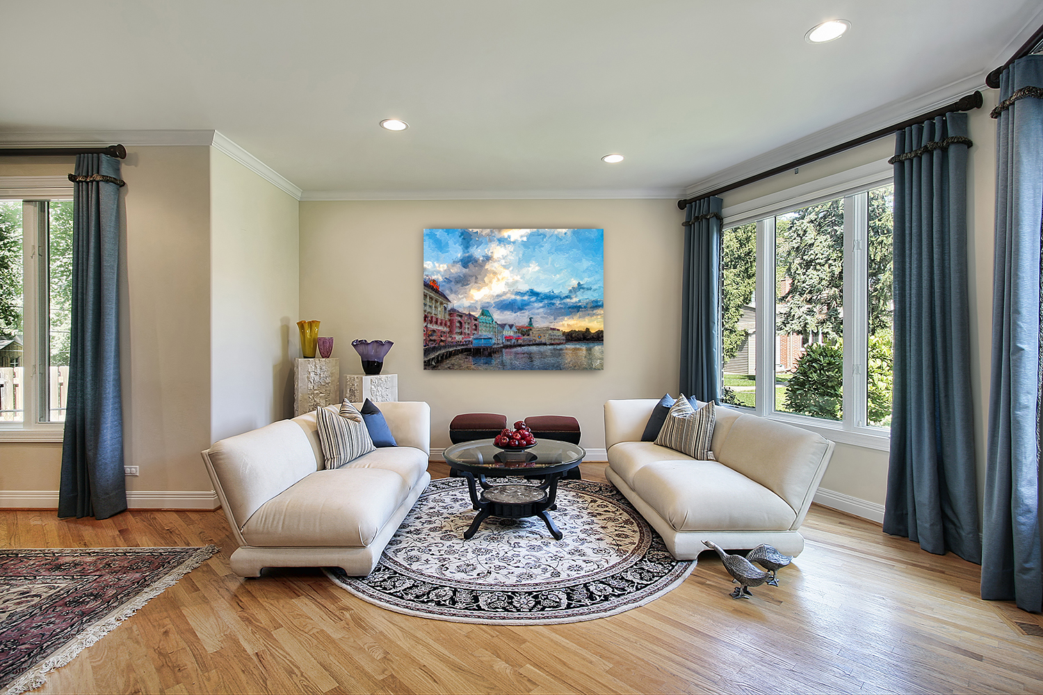
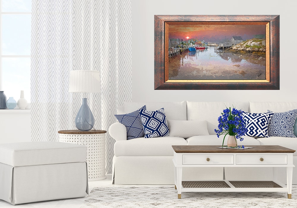
Color coordination between your room and your artwork is important in creating a cohesive and visually pleasing environment. It is important to evaluate the dominant colors already present in your room—consider the walls, furniture, rugs, and accessories. Choose artwork that either complements or subtly contrasts with these tones. For example, if your room features neutral shades like beige, gray, or white, artwork with bold, vibrant hues can serve as a focal point. Alternatively, if your space already includes strong colors, select art that echoes those tones to create harmony.
Artwork Creates Mood
The mood of the artwork should also compliment atmosphere you want in the room. Cool colors like blues and greens will provide calmness and work well in bedrooms or reading spaces, while warmer tones like reds, oranges, and yellows add energy, making them better suited for living or dining areas. Pay attention to undertones too—matching warm with warm and cool with cool tends to yield a more polished look.
Work With Color
If your artwork has multiple colors, try to pull one or two of those shades into other elements of the room through pillows, throws, or smaller decor pieces. This subtle repetition ties everything together. In the end, color coordination isn’t about perfect matches—it’s about balance, contrast, and intentionality in creating a space that feels complete and inviting.
Recent Comments